Case Study
Project Overview
Overview
StarBank is an all-in-one financial hub designed to revolutionize the mobile banking experience. We aimed to provide users with seamless access to core banking features, including crypto investments, remittances, and more. Our mission was to create a financial ecosystem that emphasizes clarity, control, and speed, eliminating the friction found in traditional banking apps.
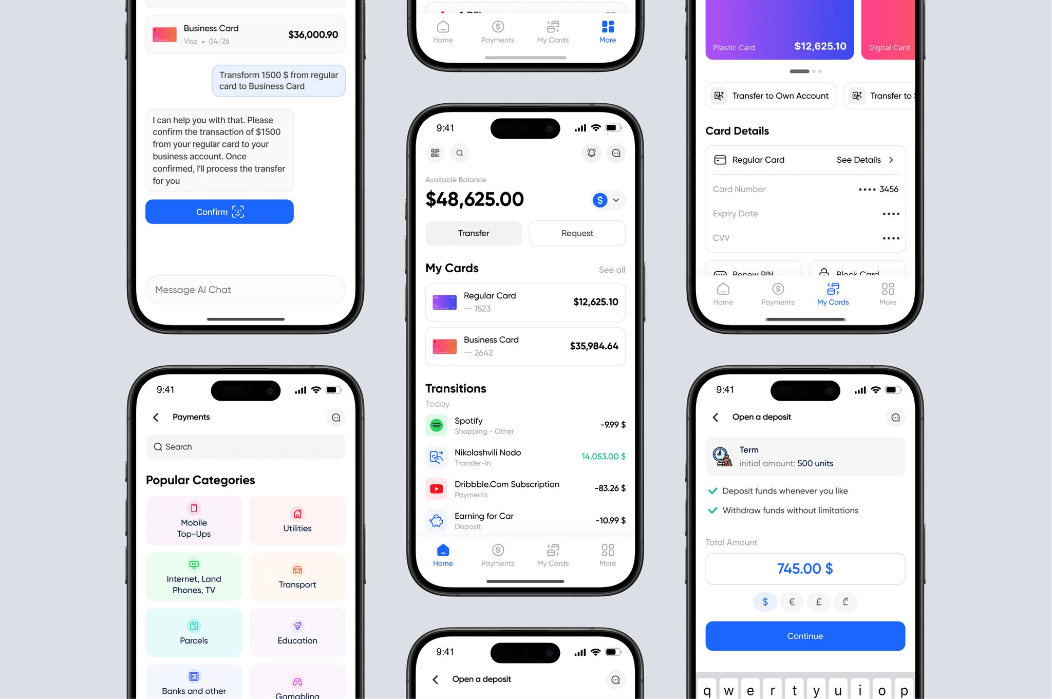
Crypto investments

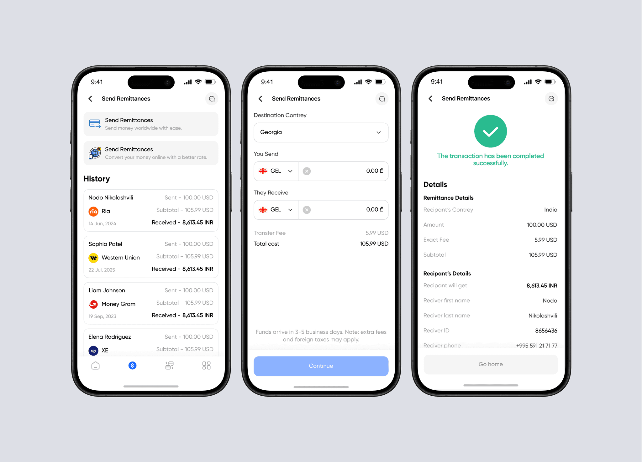
Remittances
My Role
UIUX designer - Resonsible for deep research, Interviews different users of the bank, wireframing, Prototyping, Usability Testing and iterating till i got the best possible results and UI design
Team
2 UIUX Designers
1 Graphic Designer
1 Product Manager
2 Frontend Developer
1 Fullstack Developer
1 Backend Developer
Tools
Figma
Figjam for research board
Figma mobile app for prototype testing
Timeline
8-9 Weeks
Main Problems
Traditional Georgian banking apps like TBC and BOG fail to meet the expectations of tech-savvy users. Pain points included: irrelevant push notifications, Confusing navigation, Limited investment features,Poor customer support experience. Users want clarity, control, and speed—not friction.
Problem Statements

Goal
Goal was to resolve all of those problems that users reported during interviews. we resolved: Simplify the user experience for core banking tasks (checking balance, transfers), Build a modern design system, Integrate investment and remittance features, Improve trust and retention through better UX writing and flow.
Research process
Interviewed 5 users aged 20–40 who actively use BOG/TBC apps and Surveyed 45 people via Google Forms
Key insights
87% want faster access to daily functions, 73% ignore app notifications due to irrelevance, 60% found the interface cluttered or “stressful”.
Personas
🧑💼 Persona: Nika, 28, Freelancer “I just want to open the app, see my balance, and make a transfer in under 10 seconds. Everything else can wait.”
🧑💼 Persona: Lika, 28, English Mentor and Nutricionist “I use mobile banking between client sessions, so I need it to be fast, clean, and not overwhelm me with useless info. I hate digging through menus just to send money.”
🧑💼 Persona: Natia, 39, Small Business Owner “I’m always checking balances and managing cash flow. I also want to invest, but I don’t trust the options in my current bank’s app.”
Personas in figma

Empathy maps

Interview questions (two languages)

User Journey
🗺️ User Journey Mapped out the current user journey for simple transfers and identified friction at: Login → too many steps Home → cluttered dashboard Transfer → unclear options and CTAs
🧠 Solution Strategy
Prioritize Speed & Simplicity → Designed key flows (like checking balance and transfers) to be accessible in 1–2 taps max
Design for Clarity, Not Overload → Reduced cognitive load with a cleaner layout, clear CTAs, and grouped core features.
Segment Features by User Needs → Created modular access to features like investments and remittances, so users aren’t overwhelmed.
Improve Trust through UX Writing & Visual Hierarchy → Used friendly, clear copy and consistent visual cues to make users feel safe and in control. Align Design with Business Goals → Built the UI to support user retention and conversion into higher-value features (like investment tools).
Wireframes
Created low- to mid-fidelity wireframes to validate layout and flow.
Testing
Conducting thorough testing and iterative refinement until achieving optimal outcomes.
🎨 Final UI & Visual Language
Built a modern, calm design system using research-based insights. We chose light blue (1A66FF) as the primary color to avoid heavy UI and provide comfort. The modern, clean, and easy-to-read font Gilroy contributed to a memorable brand identity. Consistency was maintained throughout the UI, including text sizes and components. Our team listened to user feedback from interviews and secondary research to ensure a user-friendly design.
🔄 Prototyping & Testing & iterating
Interactive prototype tested with 6 users using Figma mobile app. results were shocking that even our team was insanely shocked. users went throught some tough task with an ease. problem ocured only with curreny exchange which we resolved quickly and after testing it again on different users, it gave us great results.
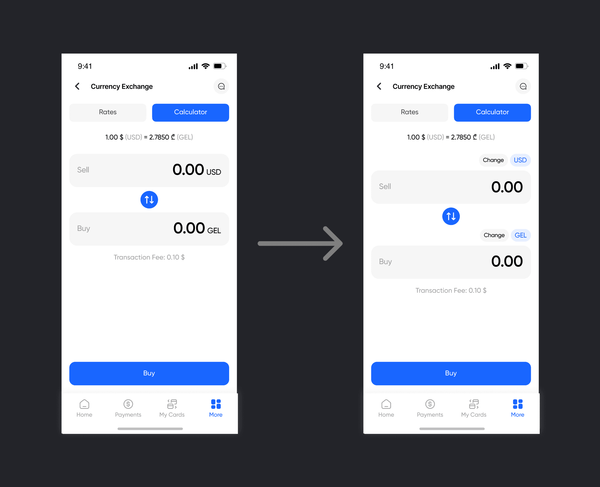
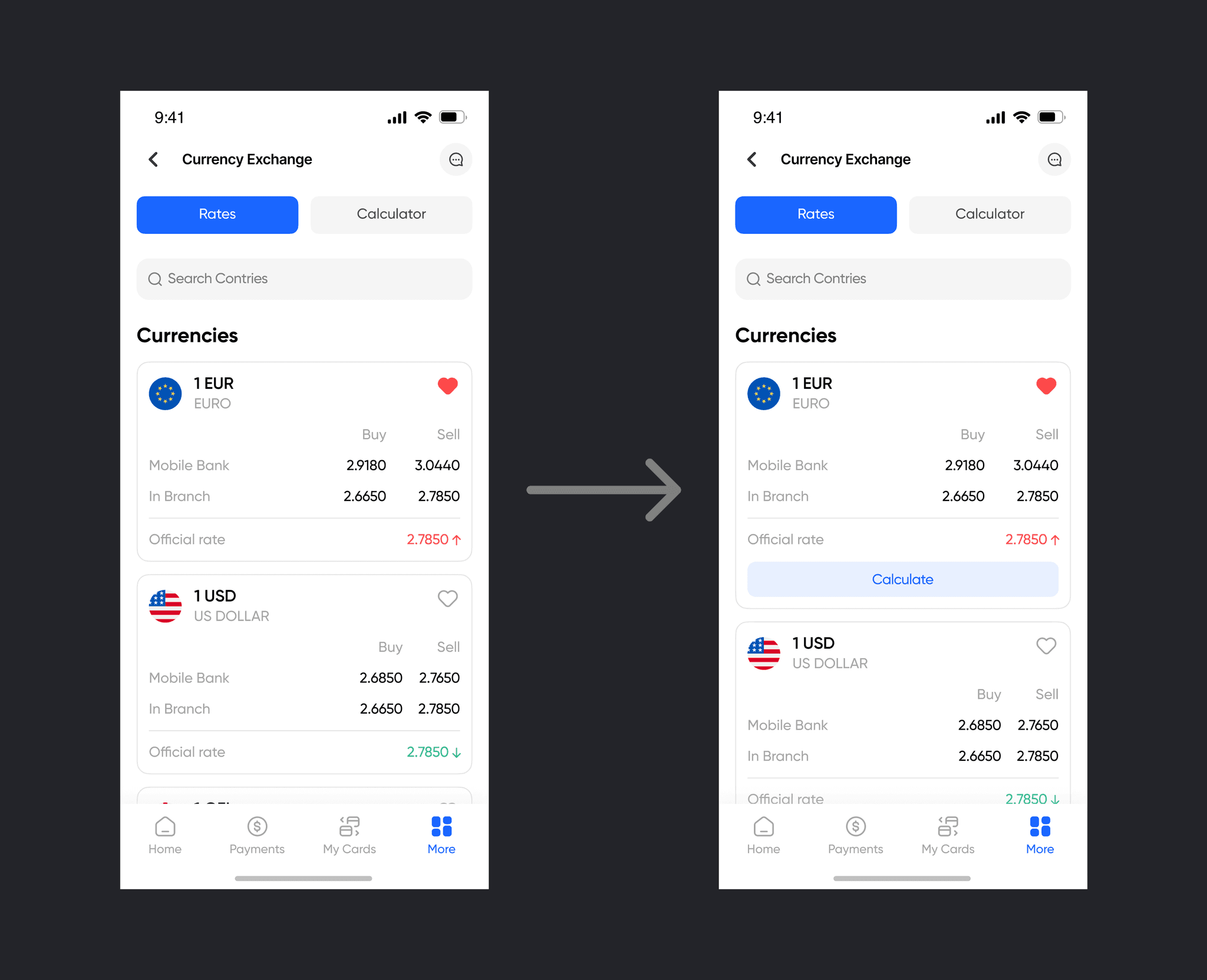
Currency exchange refinements
📈 Outcome
The redesigned StarBank app significantly improved both user satisfaction and product usability: 90% of test users completed key tasks (transfer, balance check) in under 10 seconds, meeting the speed goal set at the beginning. Reduced bounce rate on the home screen by 45% in testing sessions due to the cleaner, purpose-driven layout. Users described the app as “stress-free,” “super clear,” and “finally usable”—validating our design choices. Improved feature discoverability (investments & remittances) led to higher engagement during testing, aligning with business goals. This project not only solved user frustrations but also laid a scalable foundation for future growth, with a modular system that supports expansion into advanced financial tools.

Reflection
The redesigned StarBank app significantly improved both user satisfaction and product usability: 90% of test users completed key tasks (transfer, balance check) in under 10 seconds, meeting the speed goal set at the beginning. Reduced bounce rate on the home screen by 45% in testing sessions due to the cleaner, purpose-driven layout. Users described the app as “stress-free,” “super clear,” and “finally usable”—validating our design choices. Improved feature discoverability (investments & remittances) led to higher engagement during testing, aligning with business goals. This project not only solved user frustrations but also laid a scalable foundation for future growth, with a modular system that supports expansion into advanced financial tools.